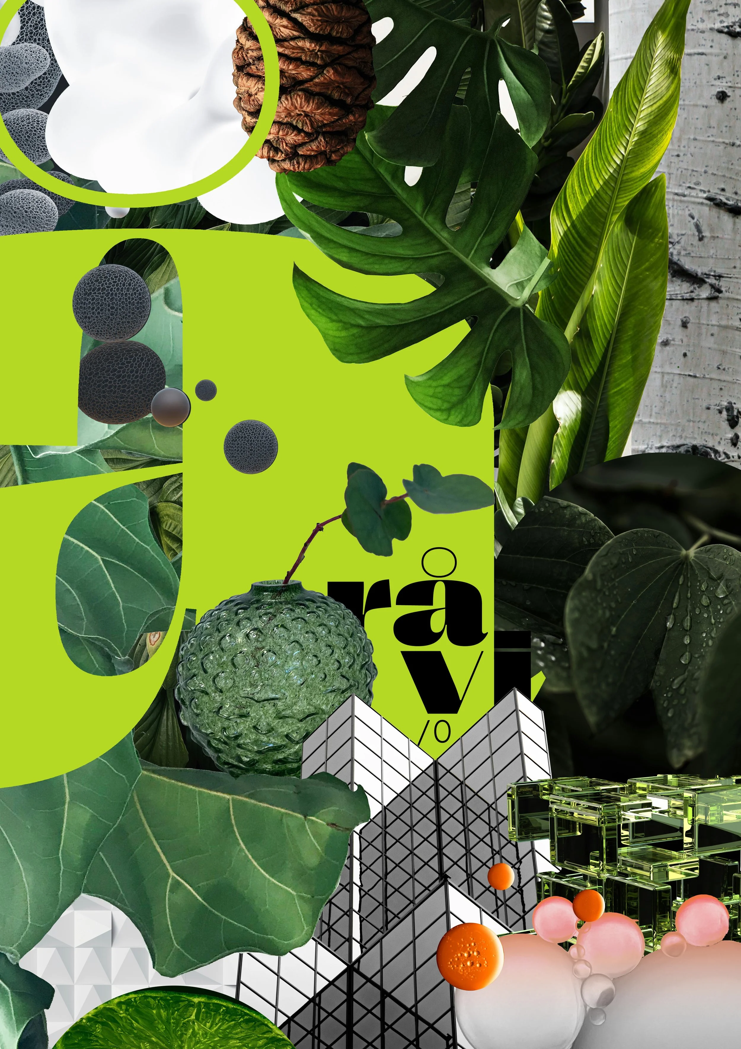
COLLABORATION WITH RÅVI ORGANICS
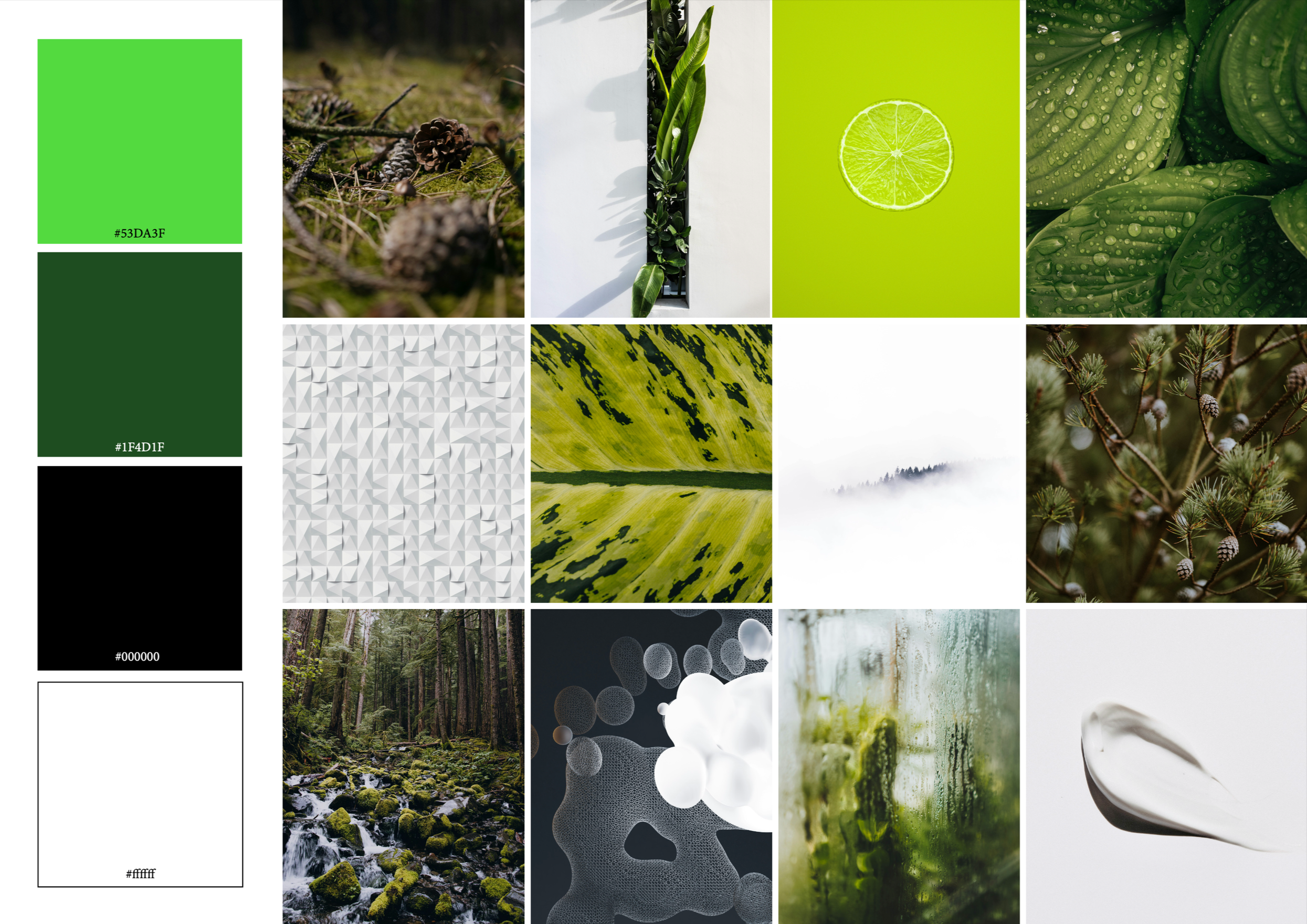
This interview brings together Catherine, founder of råvi organics, and Manuela from Manuela Menzi Studio, known for crafting poetic illustrations with a focus on gift wrapping. råvi organics is a Swiss-Swedish wellbeing brand offering natural, handcrafted room diffusers, scented candles, and Swiss-made skincare products. To reflect its deep connection to nature and dedication to quality, we partnered with Manuela Menzi Studio to design a bespoke gift wrap that invites customers into the sensory world of our brand. The illustration captures the essence of råvi — rooted in nature, inspired by craftsmanship, and enhanced through thoughtful design and modern science.
INTERVIEW: CATHERINE (råvi organics) and MANUELA (Manuela Menzi Studio)
Catherine: Who or what led you into the world of illustration? Tell us a little about yourself!
Manuela: During my studies at Central Saint Martins in London, with a good deal of luck and thanks to inspiring lecturers, I discovered my love for collage. My background is actually in textile design with a focus on knitwear. From the very beginning of each project, it was important to visually explain ideas. I can draw and paint, but always in my own way. The classical approach often wasn’t enough for me to express what I wanted to show. That’s how I came to collage, a form that feels much more open and intuitive to me. Today, this passion flows into my work as a designer of my own gift wrap collection. The play with shapes, colours, and materials inspires me daily to accompany special moments of giving with a unique expression. My designs tell stories and invite people to not just hand over a gift, but to present it with style and meaning.
Catherine: What led you to specialize in gift wrapping, and what makes this format so meaningful to you as an illustrator?
Manuela: I love wrapping gifts, writing cards, and bringing joy to someone with small gestures. At the same time, I often found myself searching for something that felt aesthetic and special, not loud or interchangeable, but high-quality and made with care. For me, gift wrap is like a quiet prelude, a first, silent impression that already tells a story before the gift is even opened. It says: someone took their time. And sometimes, that’s worth more than many words.
Catherine: Your illustrations often radiate a poetic and delicate sensibility. Where do you draw your creative inspiration from?
Manuela: From everything that surrounds me, nature, books, exhibitions, colours, conversations. Sometimes even from a sentence, a gesture, a detail. And time and again, from colours. For me, colour is the strongest means of expression, it can evoke memories, soothe, surprise, or open something that can’t be explained.
Catherine: Can you describe your typical creative process – from the first concept to the final design?
Manuela: There isn’t one typical process for me. Every creative journey begins differently: sometimes with a feeling, a photo, a shade of colour, a texture, or an idea. But there’s one thing I never do: stare at a blank page. That makes me nervous. I prefer to start with something that already exists, an image, a found object, a memory, and then, step by step and with a lot of work, I develop my piece from there.
Catherine: As the founder of Manuela Menzi Studio, how do you envision the future of your studio? Are there specific projects or directions you’d like to explore?
Manuela: I always have big plans and many goals. I hope to work on a variety of inspiring collaborations with people and brands that share similar values. It would be a dream to design more products, maybe even open a pop-up shop, or one day a small store for fine stationery and special things that bring joy to everyday life.
Catherine: What drew you to our collaboration, and how did you capture the essence of the råvi organics brand in your illustration?
Manuela: The connection to the North was immediately tangible for me, in the aesthetic of the products, the colours, the love of nature. That quiet, deep quality really spoke to me.
What especially helped was your clear vision and the mood board. From that, a sense naturally emerged of which elements could come together.
I worked a lot with intuition, with what lies between the images. And with what doesn’t demand attention loudly, but lingers for a long time.
Catherine: Is there a particular element in the illustration that holds personal meaning for you or stands out creatively?
Manuela: The fiddle-leaf fig leaves played a central role for me in the execution, both atmospherically and in terms of design. The large å from the råvi logo was a strong visual element right from the start, creating clarity and recognisability. I also really like the black-and-white grid building: a beautiful graphic structure, I love that combination.
Catherine: Thank you so much, Manuela, for this wonderful collaboration – seeing råvi organics come to life through your illustration was truly an unforgettable experience. How did you experience the collab, and what did you enjoy most about it?
Manuela: I found our collaboration to be incredibly enriching. It was marked by openness, a shared love for the North, and a refined sense of quality, something that’s not a given in the creative process.
And of course: that moment when everything comes together and the finished product is in front of you — that’s always something special.
Thank you, Catherine, for this beautiful collaboration, it was truly a joy!